A Devotion to Art: Lost Abbey Labels Tell Stories of the Beer Inside

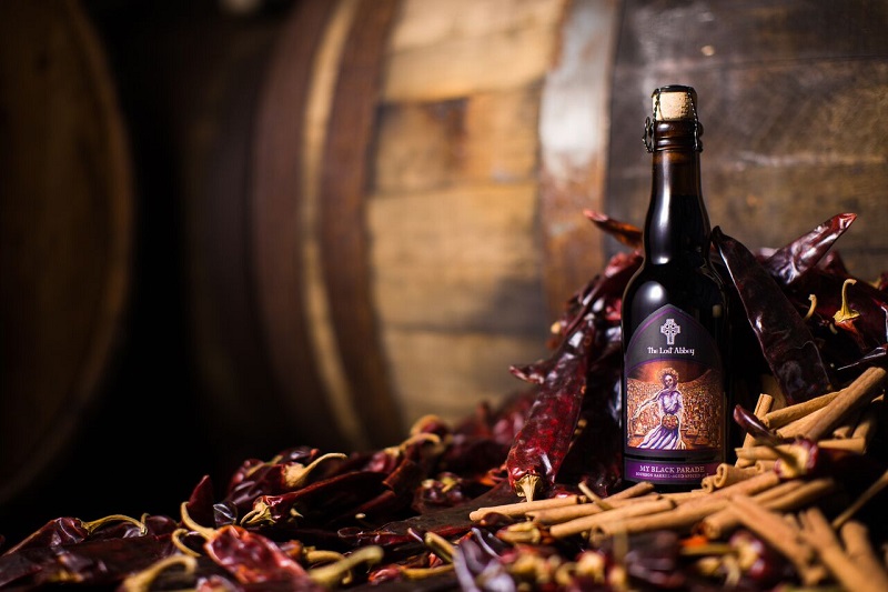
(Photo courtesy The Lost Abbey Brewing Co.)
In case you haven’t noticed, the back label in each bottle of Lost Abbey beer tells a little story to accompany the beer inside. The stories are the concoctions of Adam Martinez, director of media & marketing, and Tomme Arthur, co-founder of Lost Abbey and director of brewery operations. These stories are then handed over to artist Sean Dominguez, who puts acrylic to canvas to bring the stories to life.
“Myself and Tomme work on the story of the beer and we give Sean an idea of that story, but we let the artist be an artist,” says Martinez of Lost Abbey’s label art.

(Photo courtesy Sean Dominguez)
Though he is largely self-taught, Dominguez has been painting professionally for almost 30 years. Dominguez has done the artwork for Lost Abbey since its inception, including its iconic cross logo, and continues to do the work not only for Lost Abbey, but also for its sibling brand Port Brewing and for all of the Pizza Port brewpubs scattered around Southern California. “I used to homebrew,” say Dominguez. “I met [Pizza Port co-owner] Gina [Marsaglia] as a regular of Pizza Port. She knew I was an artist and liked the surf vibe of the work I was doing at the time, so she automatically considered me when they created Lost Abbey.
“I’m versatile,” says Dominguez of his own artistic style. “I do a lot of surf art and you can see that in my work for Port Brewing. It’s more comedic and casual. Lost Abbey is more serious. Lost Abbey brought me out of the box. … I do work in pencil, pen ink, chalk and mixed media. I hand draw and I use computers. I kinda do everything, but the Lost Abbey stuff are acrylic on canvas.”

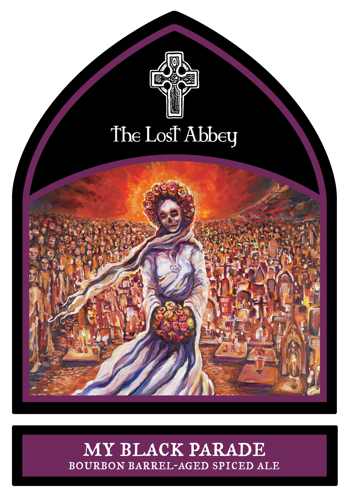
(Image courtesy The Lost Abbey Brewing Co.)
Though the team has been working together on Lost Abbey’s labels for a long time, both Martinez and Dominguez cite the label for Lost Abbey’s My Black Parade, a bourbon-barrel-aged strong ale, as one of their favorites. “We’d created a Mexican-chocolate inspired beer and we were searching for a story to accompany it when we thought of incorporating the Dia De Los Muertos backdrop,” explains Martinez. “A story of a forlorn lover, traveling to an unmarked grave each year in full wedding regalia, now with a crowd joining her in her exodus.
“The composition, color and idea about [My Black Parade],” are the reasons Dominguez cites for liking it. “[The label] was one that came easy for me. I [had] never done one like it.”
The result is striking. The My Black Parade label features a skeletal bride whose presence is made more striking by the fact that her bouquet and wreath of flowers are still colorful and bright. Behind the bride is a procession of villagers who are morphing into altars.
The connection between beer and art is apparent in Lost Abbey’s labels because Dominguez is himself a beer lover; he is easily able to combine his two passions. “I like Lost Abbey’s barrel-aged and sour beers,” he says. “My go-to would be Devotion. And I like the obscure ones. Getting those beers is one of the perks of working for them.” And a source of inspiration, no doubt.

Craft Beer deserves artistic expression equally on the outside of the bottle. Great story and the fact that Lost Abbey takes the time to make the outside of their bottles esthetically appealing makes for a better product for the consumer.